West.

LIFTD
THE BRIEF
Norwich-based small group personal training gym was looking to bring their start up to life.
Their founder and head coach Jack Smith asked me to design them a logo and identity that will stand strong within a competitive market. The new gym aimed to embody more than just working out, they aimed for a community and for people to be proud to gym their.
Jack was new to the design process but needed the full works , including the logo, social media templates, company stationery and background assets to use across their online and print collateral.
Logo Design
Stationary Design
Logo Animation
THE SOLUTION
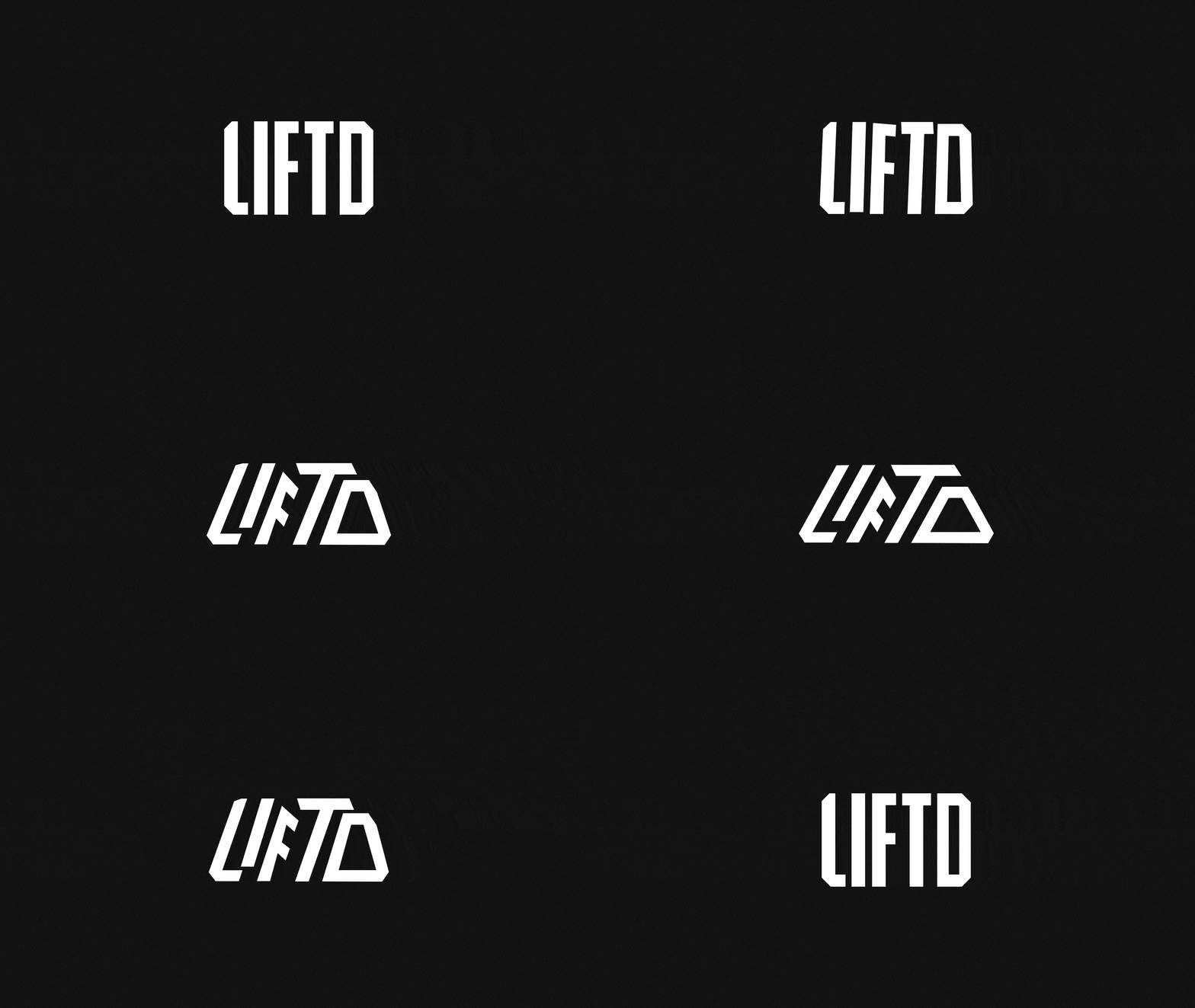
iI designed a logo that embodies the unique personality of a hexagonal cross-fit dumb-bell. This comes to light in the corners of the LIFTD logo where the corners have been shamfered. The logo holds in own & cuts through the noise in the most chaotic environments, like the gym.
I also offered a secondary logo that doubles up as the brands personal pattern. The original logo morphs and transforms into this logo as seen in the visuals.


